VOICE CHARTS
Chart reporting is not supported for individual voice reports. Instead, a set of charts on voice agents and queues are available. Individual graphs make up the charts, providing visual summaries of report statistics. These charts display a graphical representation of agent and queue performance.
Voice Agent chart
- Agent Performance chart. Located under Reporter=>Voice=>Agent reports
Voice Agent Group chart
- Agent Group Performance chart. Located under Reporter=>Voice=>Agent reports
Voice Queue chart
- Queue Performance chart. Located under Reporter=>Voice=>Queue reports
Voice Queue Group chart
- Queue Group Performance chart. Located under Reporter=>Voice=>Queue reports
Voice Agent Performance chart
The Voice Agent Performance chart displays performance statistics for voice agents. This chart includes several graphs that enable supervisors to see, at a glance, performance trends for agents including contact traffic, handling statistics, and contact statistics. This chart also displays agent shift and Make Busy statistics. (See Figure 9.)
The Handled Call Types graph shows the distribution of contact traffic by time of day. The graph contains the following information: 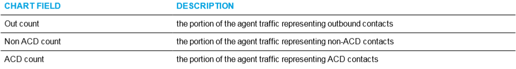
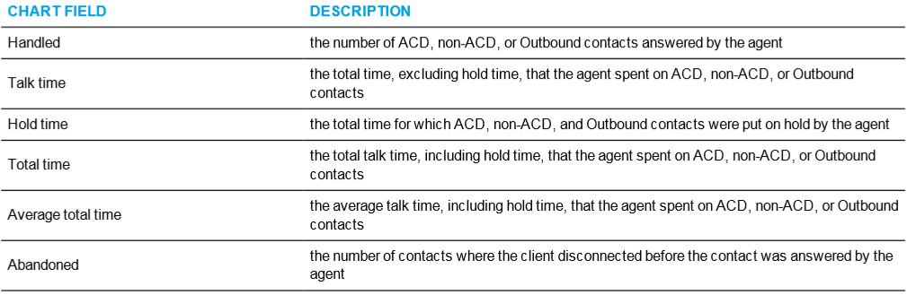
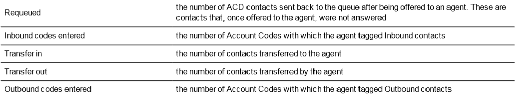
The blue tiles in the Voice Agent Performance chart display the following information.
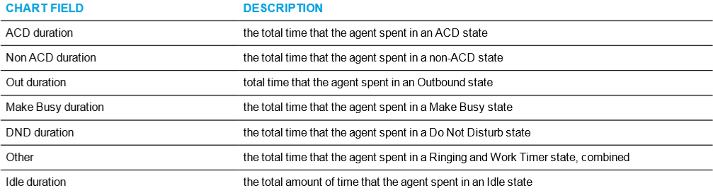
The Agent Time in States graph displays the percentage of time the agent spent in various agent states, as follows.
The Top 5 Queues graph displays the percentage of contact counts that the agent handled. The top five queues are determined by the number of ACD contacts handled.
NOTE: This graph can include queues for which agents do not answer if, for example, an agent received a contact transferred from another queue.
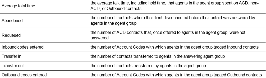
The second row of blue tiles displays agent shift information for the report's specified time period.
The Make Busy graph displays counts and the amount of time, in minutes, that agents spent in Make Busy for the reporting period. These statistics are broken down by Make Busy Reason Codes.
The bars in the graph indicate the number of Make Busy counts per Reason Code. The orange line represents the amount of time spent in Make
Busy per Reason Code, enabling supervisors to see how Make Busy duration is distributed across reasons.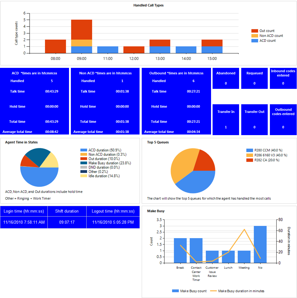
Figure 9: Voice Agent Performance chart
Voice Agent Group Performance chart
The Voice Agent Group Performance chart displays performance statistics for agent groups answering for voice queues. This chart includes several graphs that enable supervisors to see, at a glance, performance trends for agent groups including agent group traffic, agent group handling, and contact statistics. This chart also contains graphs displaying agent state statistics for the agent group and the agents in the group. (See Figure 10.)
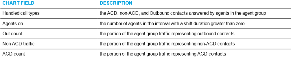
The Handled Call Types and Agents On graph displays the following information:
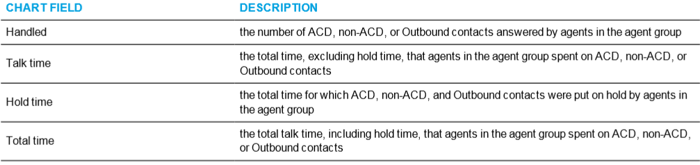
The blue tiles in the Voice Agent Group Performance chart display the following information.
The Agent Group by Queue graph displays the percentage of contact counts that the agent group handled. The queues that display are determined by the number of ACD contacts handled.
The Agent Group Time in States graph displays the percentage of time in which the agent group spent in various agent states, as follows.
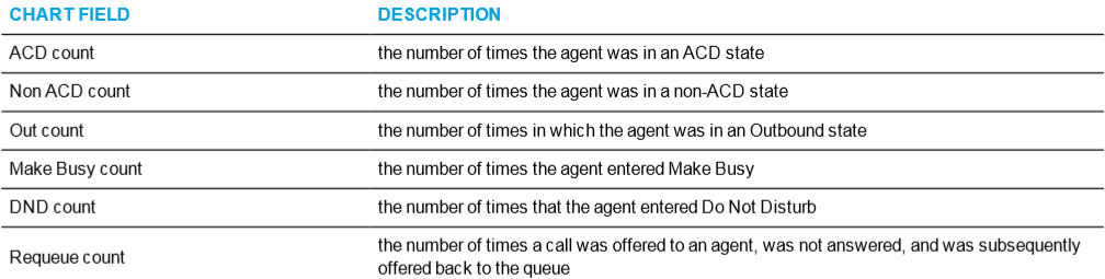
The Agent Activity Count graph displays the number of times in which agents in the agent group spent in various states, as follows.
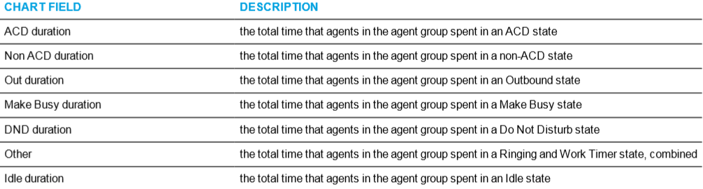
The Agent Time in State graph displays the amount of time, in minutes, in which agents in the agent group spent in various states, as follows.
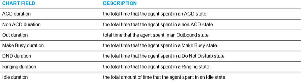
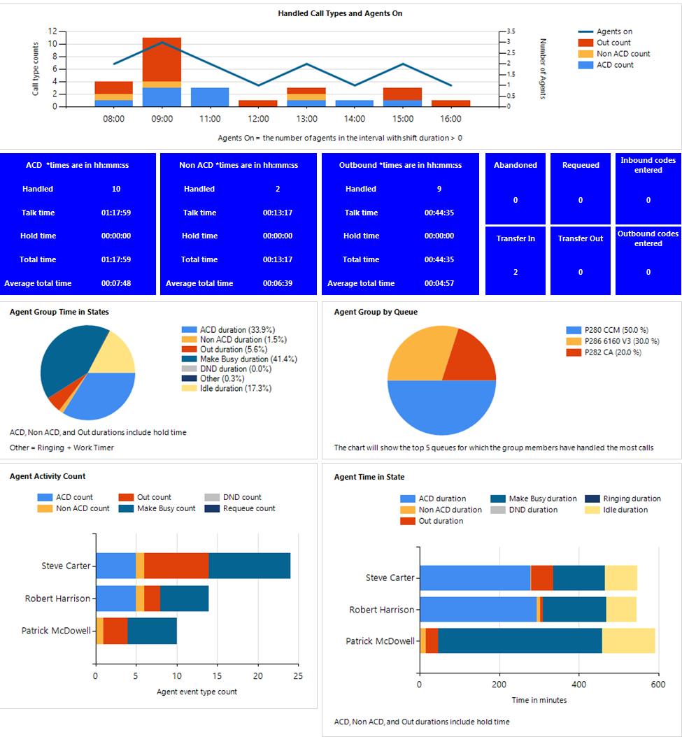
Figure 10: Voice Agent Group Performance chart
Voice Queue Performance chart
The Voice Queue Performance chart displays performance statistics for voice queues. The chart enables supervisors to see, at a glance, performance trends for queues by time of day, contacts offered, and agents available. The chart also shows contacts affecting the contact center's Service Level, by time of day. (See Figure 11.)
If Handled bars display higher than Service count bars, contacts are not being answered in the queue's Service Level time. If Service count bars are higher than Handled bars, contacts are being abandoned and/or interflowed.
The Voice Queue Performance chart displays the following information:
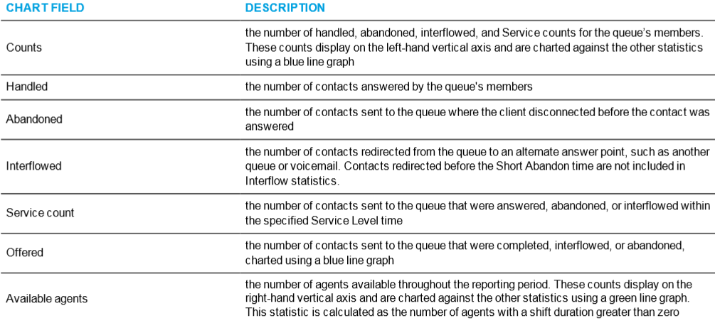
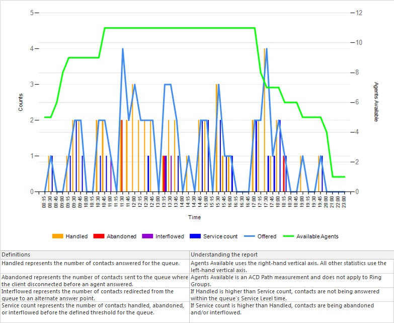
Figure 11: Voice Queue Performance chart
Voice Queue Group Performance chart
The Voice Queue Group Performance chart displays detailed information for voice queues comprising queue groups. The chart includes several graphs that enable supervisors to see, at a glance, the queues' handling, traffic, service level, and available agent statistics. The chart also indicates whether queues in a queue group are meeting their Service Level targets. (See Figure 12.)
The Voice Queue Group Performance chart displays the following graphs and information:
The Handled by Hour graph shows the number of ACD contacts handled by the queue group during the reporting interval. This includes offered, completed, and abandoned contacts.
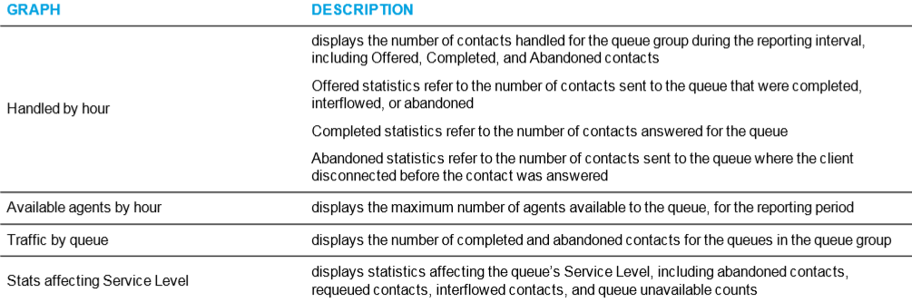
In addition to the information displayed by the graphs listed above, the Voice Queue Group Performance chart displays the following information.
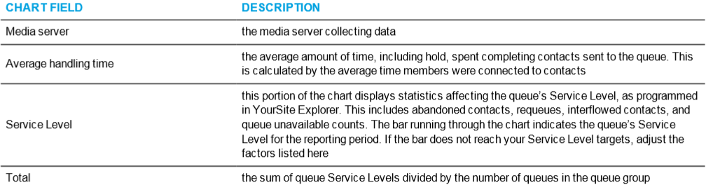
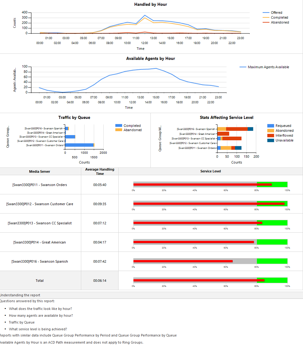
Figure 12: Voice Queue Group Performance chart